 ENTSO-E
ERAA 2024Visuals
Inputs
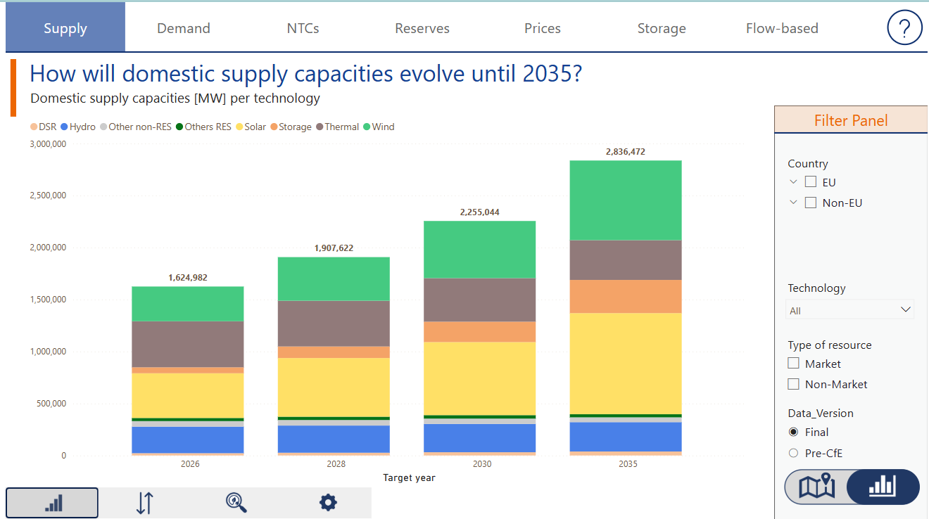
Domestic Supply
The absolute generation capacities visual presents the domestic supply capacities (in MW) per technology for each Target Year. A map and graph visualization are available for further exploration.
The variation in supply capacities visual displays the change in domestic supply capacities (in MW) per technology between 2026 and 2035.
The RES electricity generation potential visual illustrates the potential electricity generation (in TWh) from hydro, large-scale solar, and wind sources per Target Year.
The thermal unit maintenance visual presents the percentage of thermal units under maintenance throughout the year for each Target Year.
Electricity Demand
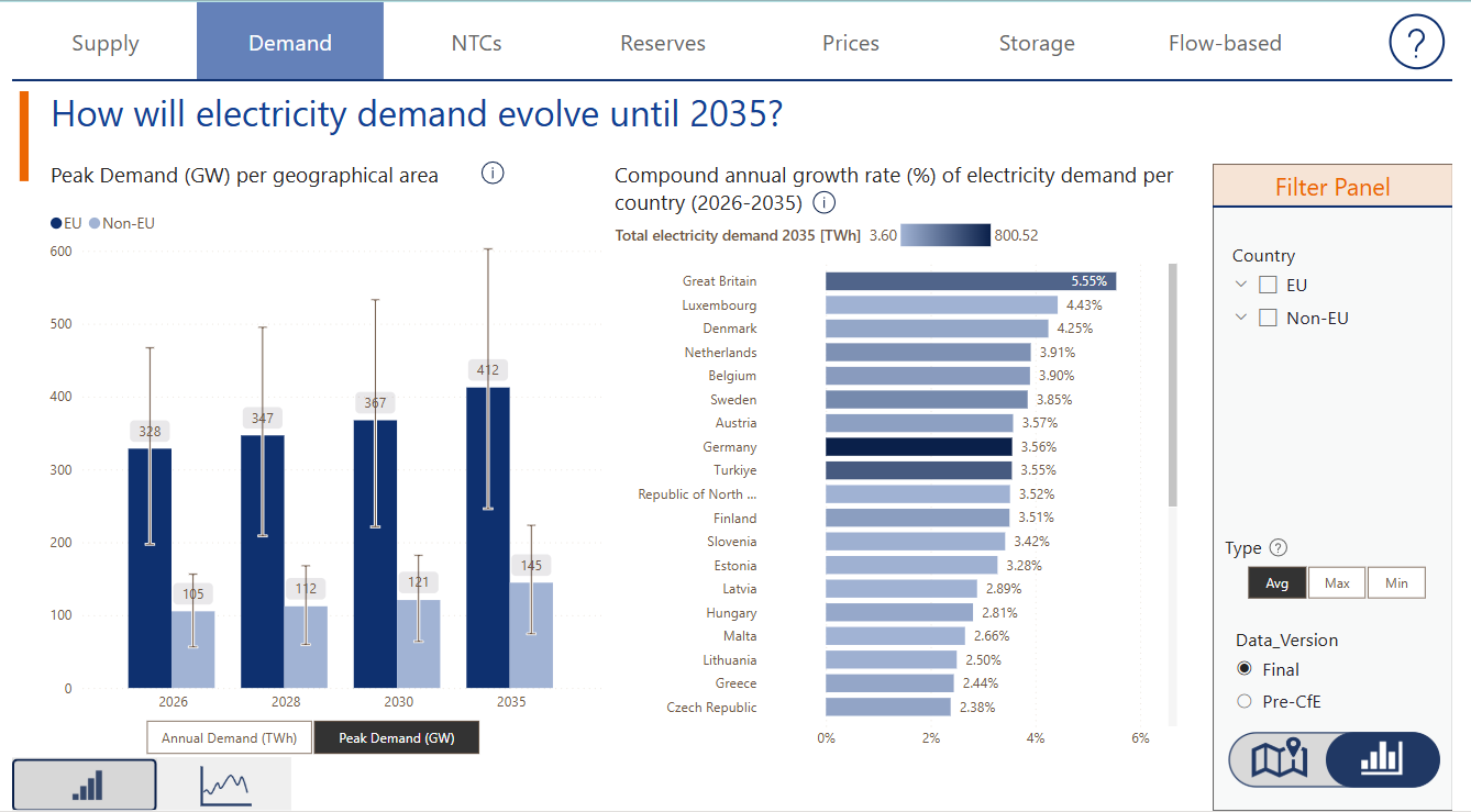
The aggregated yearly data presents the annual electricity demand (in TWh) for each Target Year, aggregated by geographical area (EU and non-EU). Below the figure, clicking on “Peak Demand (GW)” reveals the annual peak demand by Target Year and geographical area. It also includes the compound annual growth rate (CAGR) of electricity demand per country from 2026 to 2035. A map and graph visualization are available under the Filter Panel for further exploration.
Additionally, the daily time series illustrates the evolution of daily gross electricity demand (in GWh) for each Target Year.
Net Transfer Capacities (NTCs)
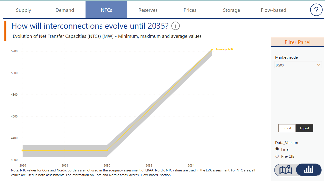
The net transfer capacities visual presents the evolution of net transfer capacities (in MW) over time. A map and graph visualization are available for further exploration.
Balancing Reserves
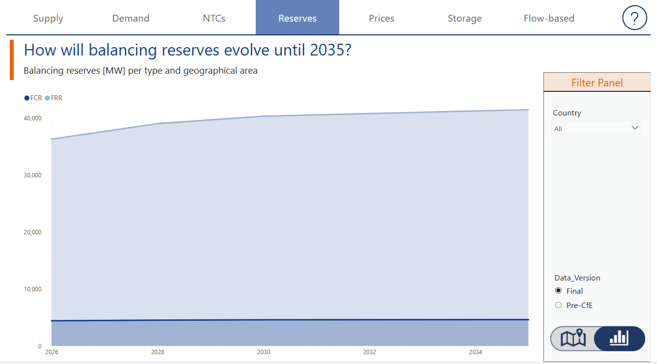
The visual represents the balancing reserves per type and geographical area (in MW) over time. A map and graph visualization are available for further exploration.
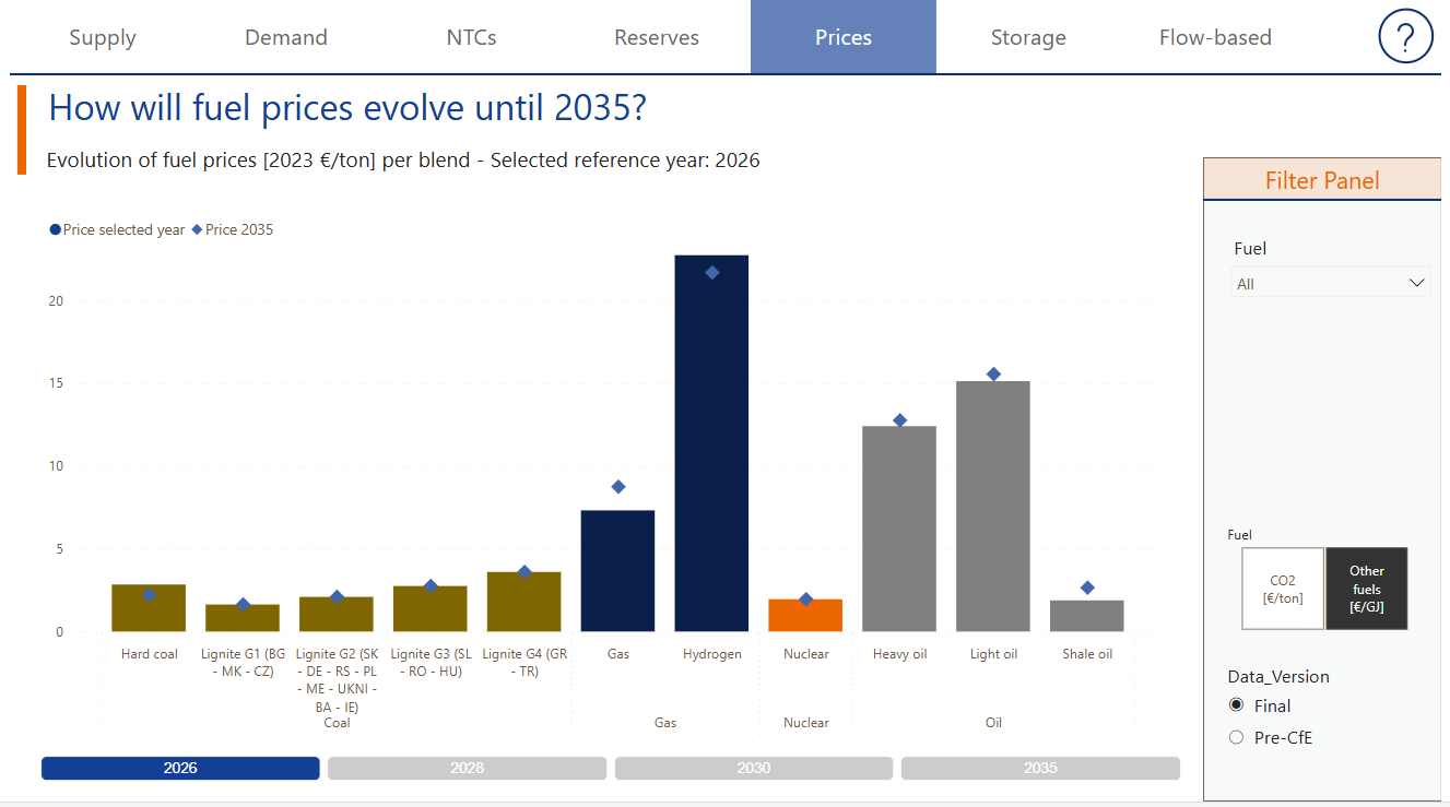
Fuel prices
The visual presents the evolution of prices per fuel blend (in 2023 EUR/ton) per Target Year.map and graph visualization are available for further exploration.
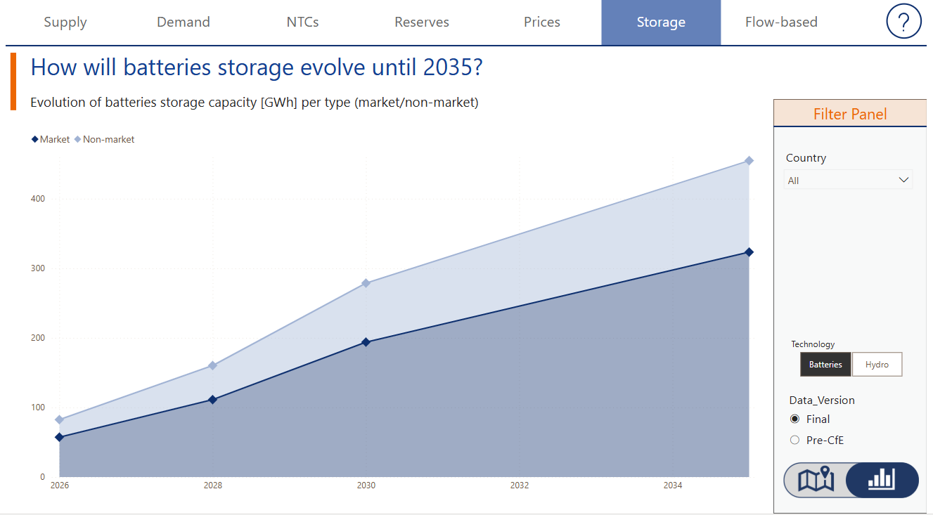
Storage
The visual presents the evolution of battery storage capacity per type (in GWh) over time. A map and graph visualization are available for further exploration.
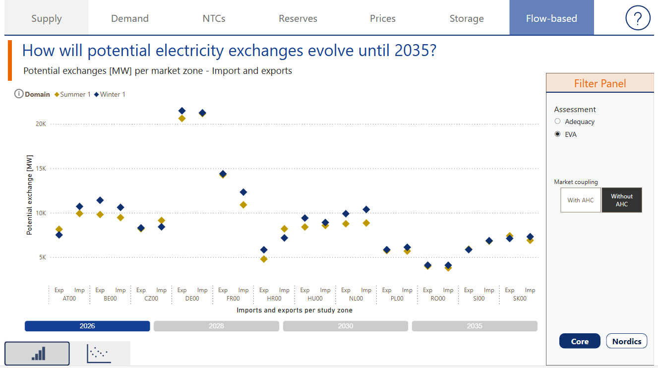
Flow-based domains
The Flow-Based visual presents a static view of net positions, illustrating the potential exchanges (in MW) per market zone, including imports and exports for each Target Year. In the bottom left corner, an option allows selecting the evolution of values per study zone, while the bottom right corner provides a selection between the Core region and the Nordics region.
Outputs
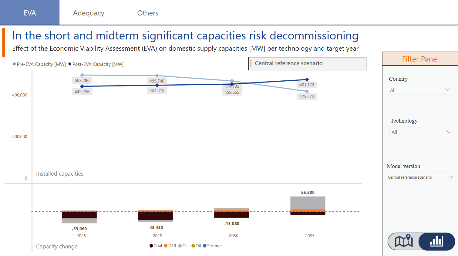
EVA results
The Economic Viability Assessment (EVA) visual presents the effect of the EVA on domestic supply capacities (in MW) per technology and Target Year. An option to visualize the data in a graph or map is available for further exploration.
Adequacy results
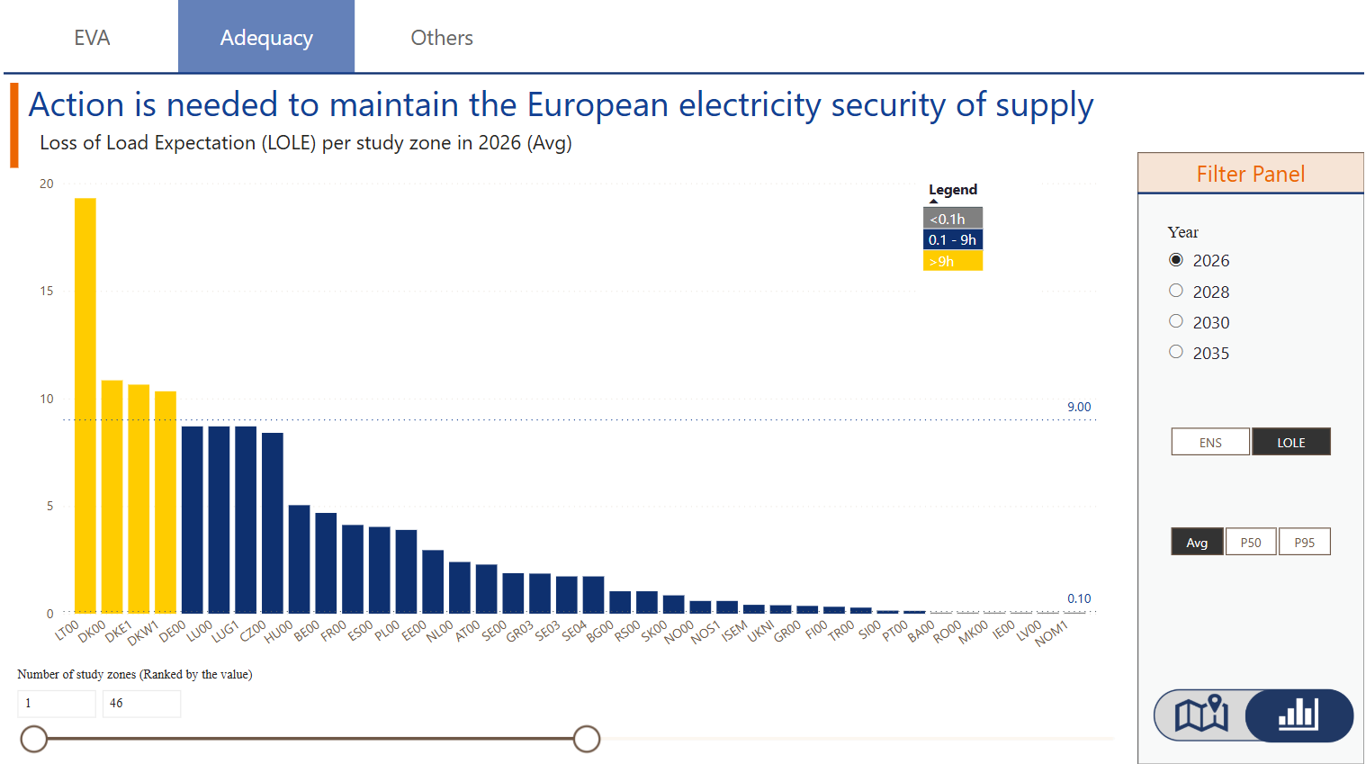
Under the adequacy tab, it is possible to visualise the Energy Non-Served (ENS) as well as the Loss of Load Expectation (LOLE) per study zone for a given year. The user can choose to visualise the ENS or LOLE using the command in the Filter Panel. In addition, the Filter Panel allows selecting different Target Years and adjusting other parameters. An option to visualize the data in a graph or map is available for further exploration.
ENS Convergence
The Energy Not Served (ENS) Convergence visual presents six different measures, each with a distinct visualization. The desired measure can be selected in the bottom of the page.
- The Coefficient of Variation displays results for the entire study area per Target Year.
- The EENS shows the cumulative ENS (EENS) across MC samples for the entire study area per Target Year.
- The ENS (MWh) shows results for the entire study area per Target Year.
- The Lower Bound of the 95% Confidence Interval presents values for the entire study area per Target Year.
- The Upper Bound of the 95% Confidence Interval provides values for the entire study area per Target Year.
- The Variance of EENS_N is shown for the entire study area per Target Year.
