 ENTSO-E
ERAA 2021Visuals
Inputs
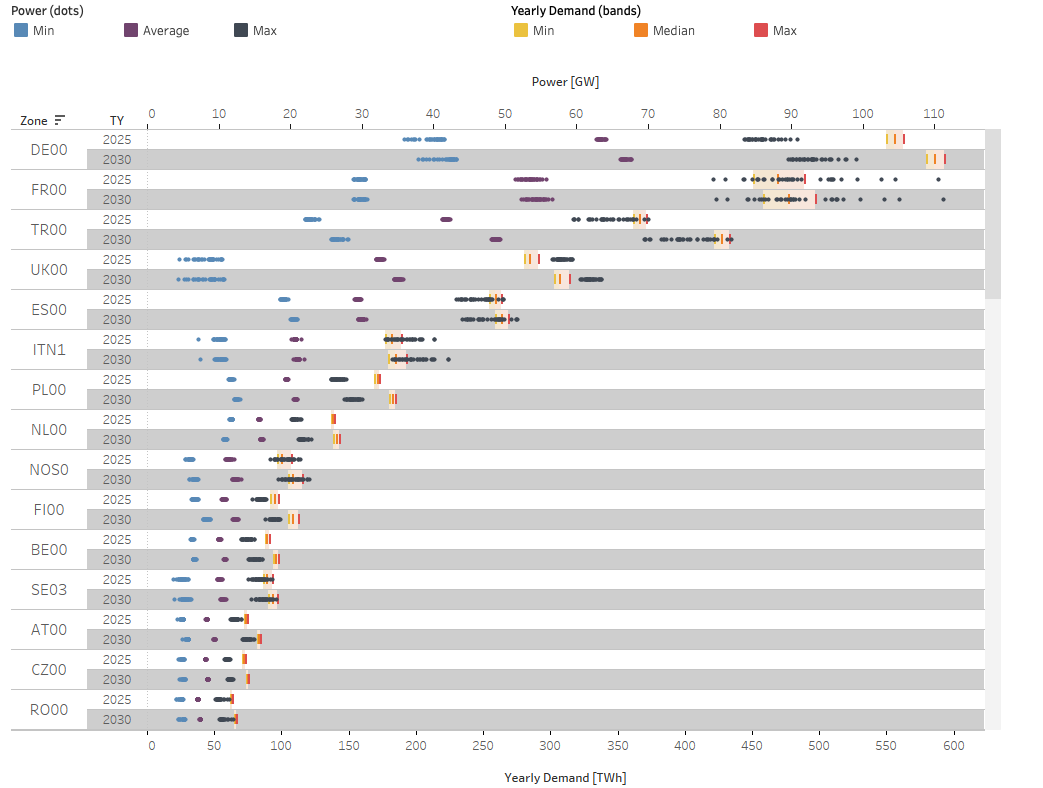
Demand
The visual shows yearly demand values as well as hourly demand values by market zone and Target Year. More precisely, the figure shows the minimum to median and median to maximum yearly demand ranges across all 35 Climate Years (bars) and the minimum, median and maximum/peak hourly demands across the 35 climate years (dots).
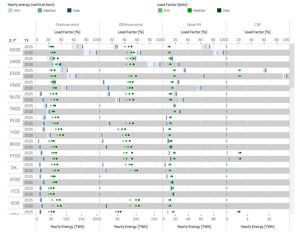
PECD energy variables
The visual shows the minimum, median and maximum yearly available RES energy that can be generated by these technologies and injected in the grid under all climate years, provided there is sufficient demand, as well as the derived load factors (assuming 100% of the available energy is injected in the grid). The available energy is calculated based on the installed capacities of the reported technologies and wind & solar load factor profiles.
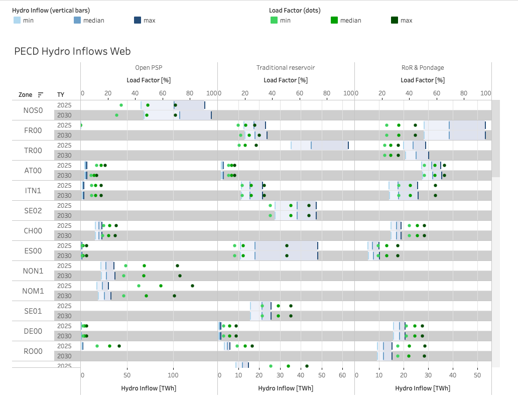
PECD hydro inflows
The visual shows the minimum, median and maximum yearly energy content of water inflows of hydro storage technologies, which is either injected in the grid or being stored, under all climate years, as well as the derived load factors (assuming 100% of the available energy is injected in the grid).
The load factor is defined as the water inflow summed to the difference in reservoir levels between the beginning and end of the year over the energy produced under nominal turbining assumptions over the year. The visual shows the hydro categories run-of-river (RoR) and pondage, traditional reservoir and open pumped storage plant (Open PSP).
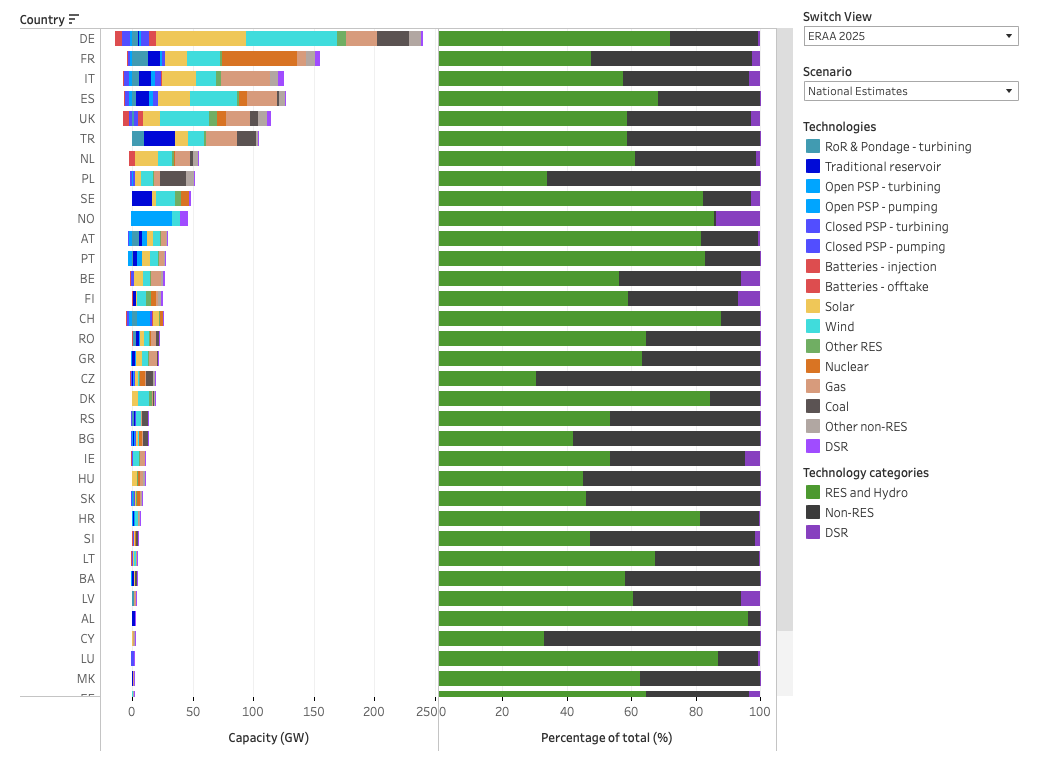
Installed capacity for ‘National Trends’ and ‘National Trends with low thermal’ scenarios
The visual shows – for TYs 2025 and 2030 – the resource capacities (net generation capacity and DSR) by country and technology in the left part and the capacity mix of renewable energy sources (RES), non-RES and DSR capacities by country in the right part. Positive resource capacity values represent generation/injection/load reduction capacities, whereas negative values represent pumping/offtake capacities corresponding to PSP units and batteries.
Neither pumping capacities nor closed PSP or battery capacities are reported in the capacity mix calculations (c.f. RES / non-RES mix provided in %), as they first take off energy from the grid before injecting it again at a later time. Open PSP technology, however, is considered renewable as it also receives water inflows.
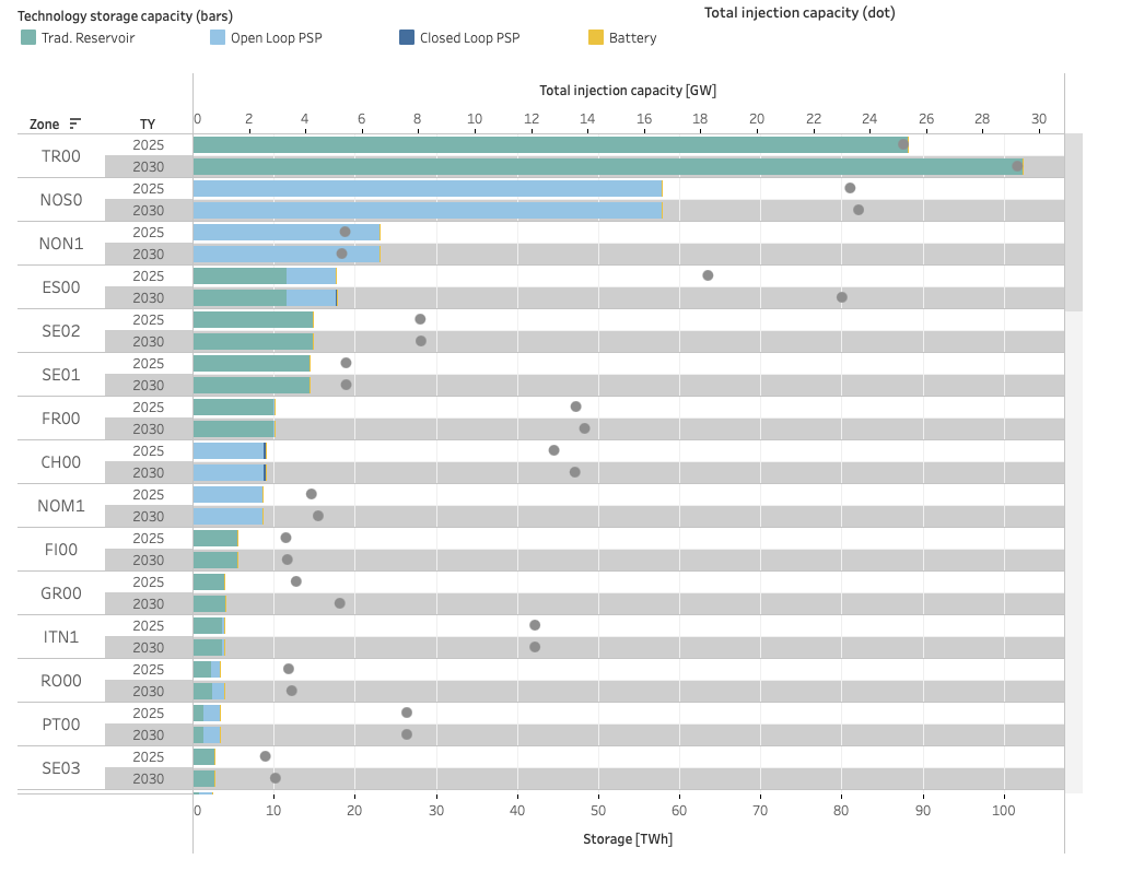
Storage capacities
The visual shows the energy content of the storage capacities (stacked bars) expressed in TWh for each storage technology, as well as the total injection capacity of these technologies (dots) expressed in GW per market zone and target year.
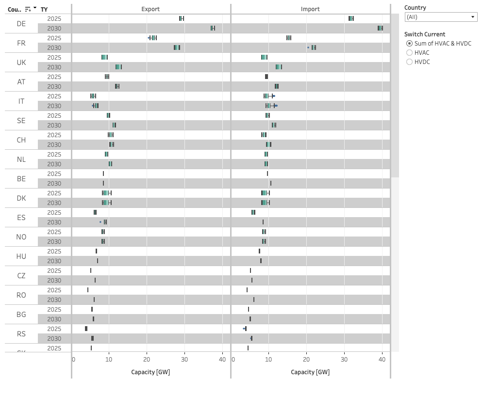
NTC boxplot visual
The visual shows the Net Transfer Capacities at the import and export sides per country and target year. The boxplots represent the distribution of the maximum hourly NTC capacities for a given country, TY and export/import direction across all the CYs. The green ranges represent the 1st quartile value, the median and the 3rd quartile value respectively, the lower and upper hinges represent the lowest and highest values within 1.5 times the interquartile range from the 1st quartile and the 3rd quartile value respectively. The values not comprised between the hinges are considered as outliers and plotted with dots.
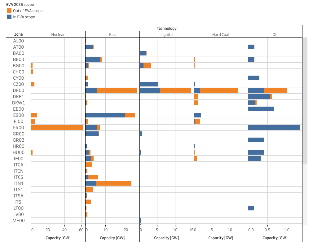
EVA capacity scope
The visual illustrates the installed capacity subject to the EVA assessment as well as the capacity excluded from it.
Outputs
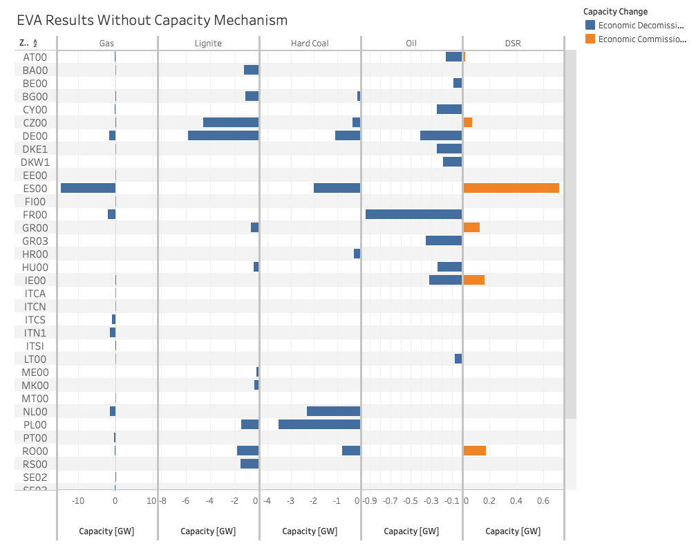
EVA results under Central scenario without Capacity Mechanism
The visual shows the installed capacities decommissioned per technology and bidding zone following the EVA step in the Central scenario without Capacity Mechanism.
EVA results under Central scenario with Capacity Mechanism
The visual shows the installed capacity change per bidding zone of the EVA steps in the Central scenario with Capacity Mechanism compared to the Central scenario without Capacity Mechanism.
Results Benchmarking “National Estimates”
This visual shows the LOLE and ENS result differences between various tools compared to the reference tool.
Results Benchmarking “National Estimates with Low Thermal”
This visual shows the LOLE and ENS result differences between various tools compared to the reference tool.
Results Benchmarking “Central without CM”
This visual shows the LOLE and ENS result differences between various tools compared to the reference tool.
Results Benchmarking “Central with CM”
This visual shows the LOLE and ENS result differences between various tools compared to the reference tool.